Brand Identity + Design System
Calm Current
Calm Current is a wellness app designed to help burned-out adults regulate their nervous systems without abstract or overwhelming experiences. We led the brand identity and product design system from end to end, defining positioning, visual language, and scalable UI patterns. The result was a wellness brand and design system built around clarity and regulation, enabling consistent UI decisions, faster iteration, and a reassuring experience for users across every touch point.


Discovery & Strategy
We defined Calm Current’s mission and value proposition through competitive analysis and audience insights. This work shaped the brand’s voice, tone, and visual direction, setting clear guidance for all brand and product decisions.

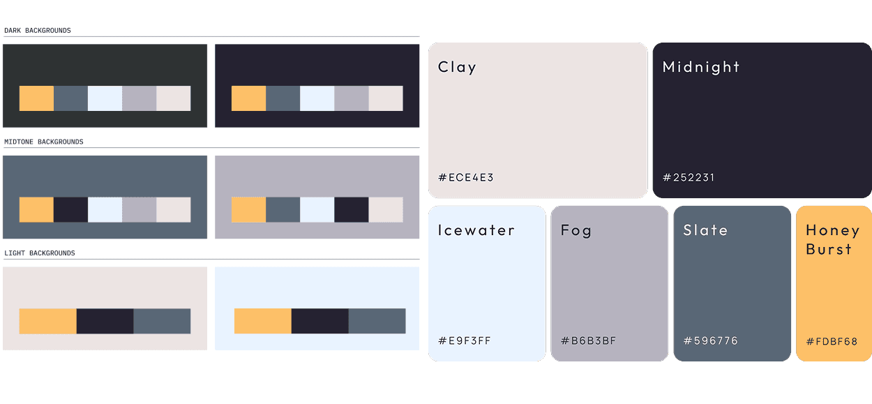
Color
The color system was designed to support regulation and focus. Muted, natural tones reduce visual noise while maintaining clarity and trust. The palette balances warmth with restraint so the product feels calming without becoming passive, and credible without feeling clinical.
Typography
The typography system prioritizes clarity, hierarchy, and long-form readability. Type styles support calm scanning and consistent structure across screens, helping users take in information with minimal effort. The system balances personality with restraint and scales easily across product and marketing.

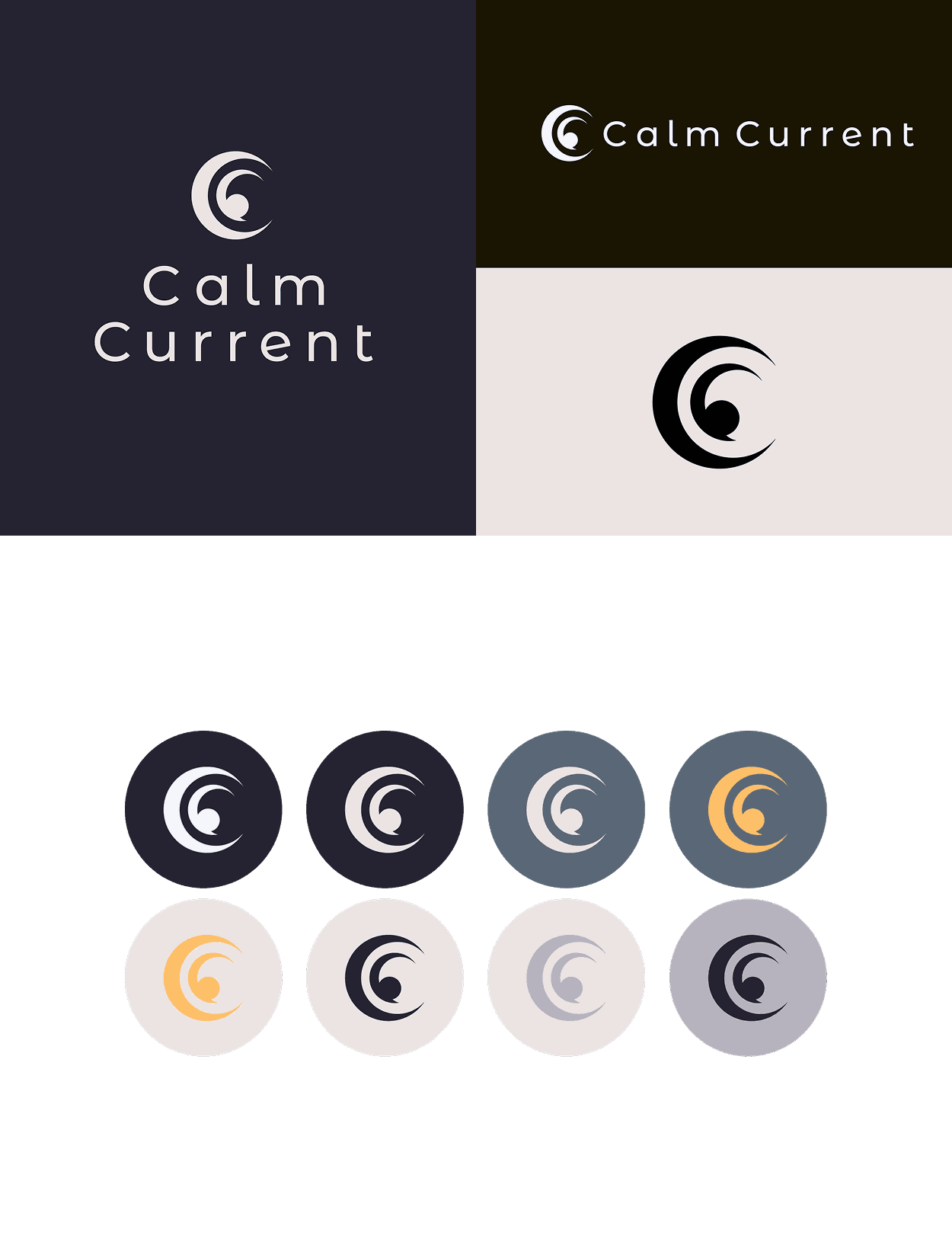
Logo Suite
The Calm Current logo expresses regulation through flow and repetition. Concentric curves echo natural rhythms and continuity, creating a mark that feels steady and composed. By avoiding literal wellness imagery, the logo communicates calm in a way that feels restrained, credible, and enduring. Subtle irregularity keeps the form human and imperfect, reflecting nervous system regulation. A system-first construction allows the mark to scale cleanly across UI.
Visual Language
The photography and visual language reinforce a sense of calm presence rooted in everyday moments. Imagery centers on natural textures and subtle movement, with scenes that feel real and unposed. Within product mockups, photography supports the UI and content, helping the brand remain clear and consistent across digital and physical touchpoints.
