Brand Identity + Design System
Hearth & Ledger
Hearth & Ledger is a relationship-first wealth platform designed to help independent advisors manage client relationships with clarity and trust. We designed the brand identity and product design system, establishing the visual language, UI patterns, and core screens built to scale across advisor and client experiences. RESULTS The result was a financial brand and design system that balanced credibility with clarity. The system enabled consistent UI decisions, faster product iteration, and a more confident experience for advisors and clients alike as the platform evolved.


Discovery & Strategy
Discovery and strategy focused on understanding the financial advisory landscape and where Hearth & Ledger could stand apart. We conducted a competitive audit and market research to identify gaps in tone, usability, and visual presence. This work informed a brand voice, tone, and visual direction that balanced professionalism with approachability.
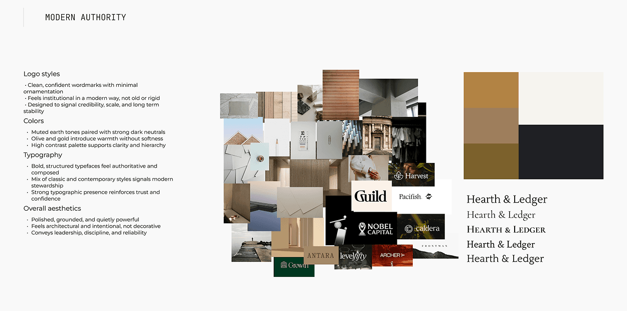
Color
The color system was designed to support trust and focus. Warm neutrals improve legibility and minimize visual noise, reinforcing a professional tone for financial decisions. This approach creates a cohesive experience across marketing, advisor tools, and client-facing views.

Typography
The typography system was designed to guide attention and support legibility in complex financial contexts. Typefaces were selected to introduce a sense of timelessness, while thoughtful hierarchy helps users scan and understand information quickly, reinforcing a professional tone throughout the product.

Logo Suite
The Hearth & Ledger logo is built around typography as the primary expression of the brand. The wordmark takes precedence, reinforcing credibility and longevity, with a custom letterform that carry meaning through structure and detail. The ledger detail embedded within the mark references record-keeping, continuity, and care, anchoring the brand in its financial context. The result is a composed logo that scales confidently across product UI, marketing, and brand touchpoints without losing its presence.

Visual Language
The visual language was designed to support clarity, trust, and a human sense of scale. Imagery focuses on natural light, subtle texture, and everyday moments rather than aspirational finance clichés. Within product and marketing, visuals work in balance with the UI, reinforcing the brand without competing with content.
